Turning a rebrand into a living digital system
A legacy brand seeking a new generation
Proximus was undeniably reliable and deeply trusted by families, but it was struggling to connect with a younger audience. To shift perception, the company launched a bold, vibrant rebrand. I joined the Brand Experience team to translate that new vision into a living digital ecosystem.
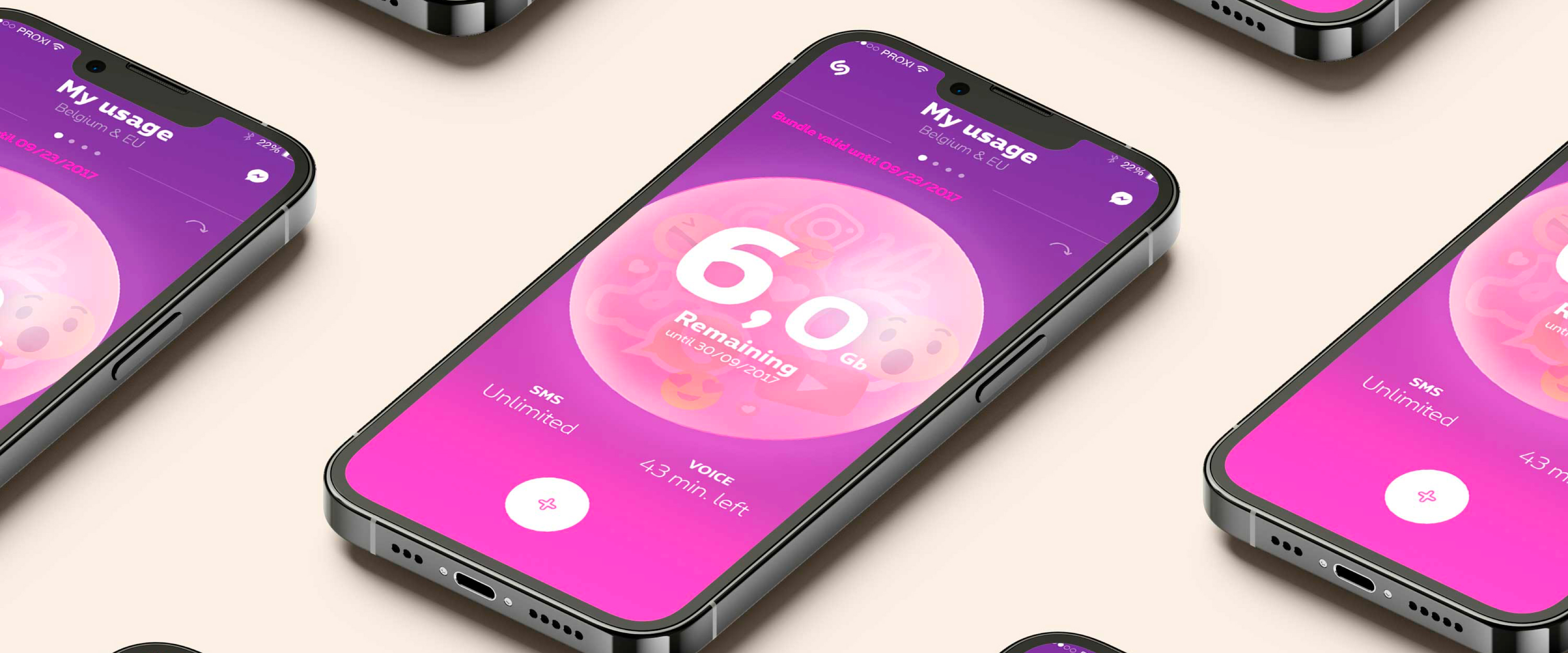
Translating Proximus' new brand identity into a data consumption experience.
Dozens of teams. One deadline. No shared system.
A new visual identity is only as strong as its execution. Proximus was rolling out its rebrand across every digital surface: the consumer app, web portals, support, operations, and retail. The brand team had the vision. The product teams had the deadlines.
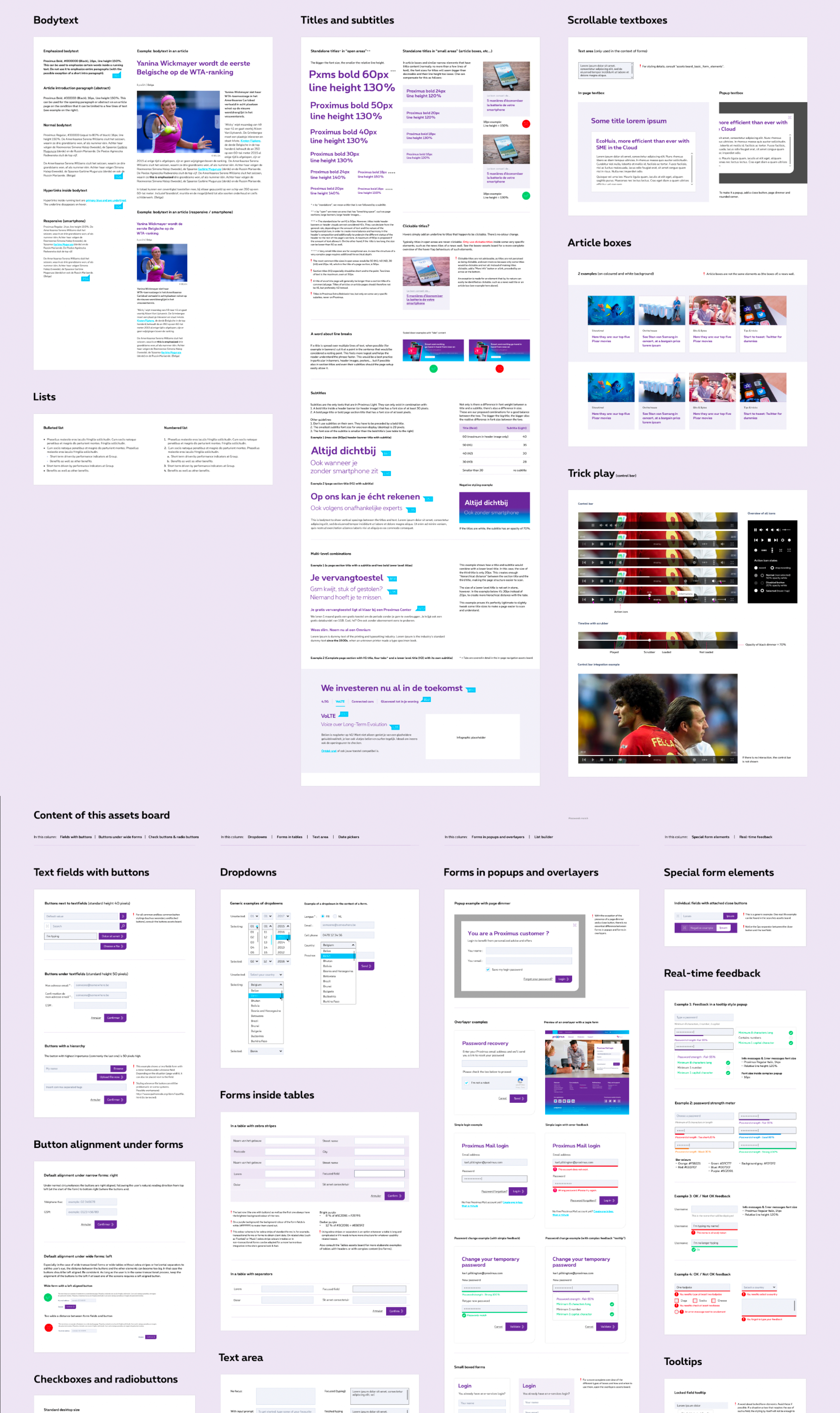
I built the design system layer that served as the translation engine between creative ambition and engineering reality. By centralizing tokens, components, and interaction patterns, we created a single source of truth that ensured whether a user was checking their data usage or troubleshooting their router, the experience felt unmistakably Proximus.
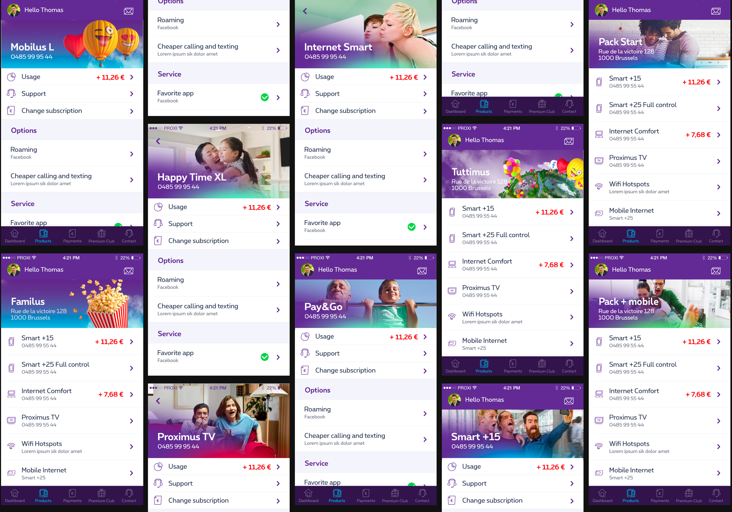
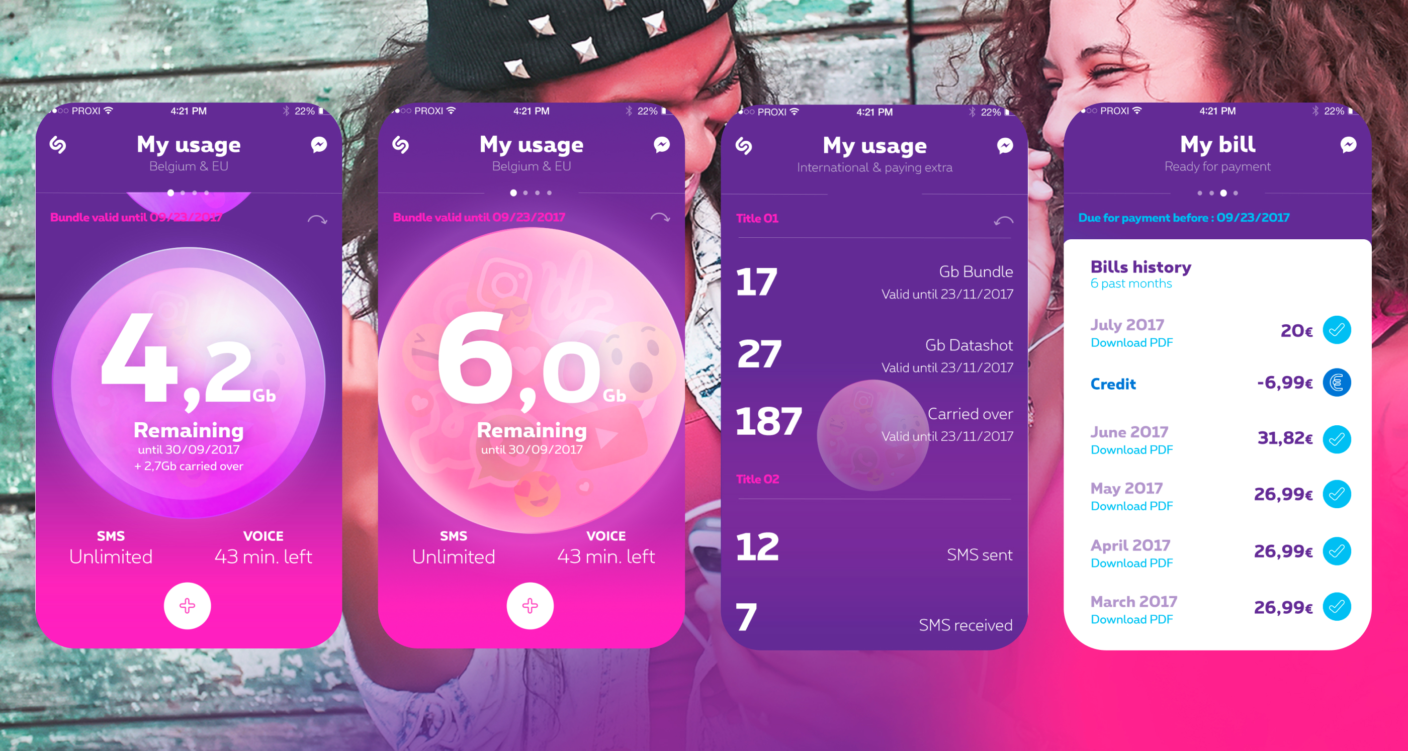
One pattern, every product. Standardized navigation and component architecture across different subscription types in the MyProximus app.
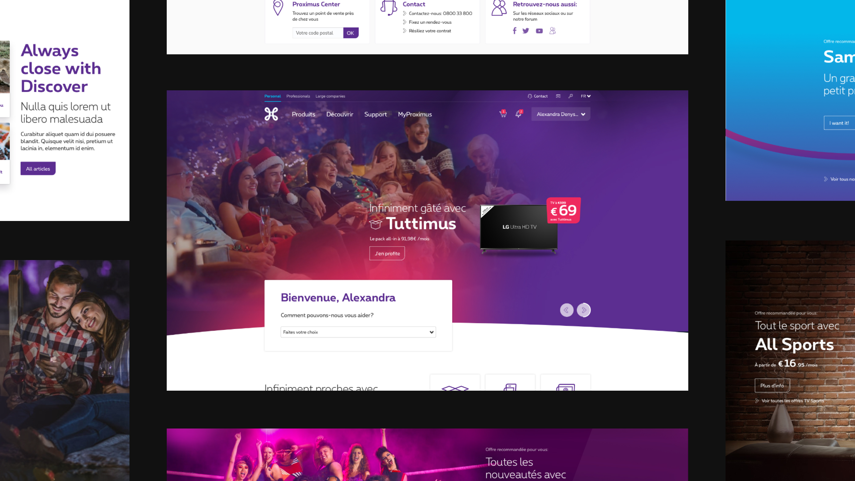
The system scaled across platforms, ensuring the web experience mirrored the app's structural DNA.
A system that bends without breaking
A telecom's digital ecosystem has to serve two drastically different masters. It needs the strict, functional rigor required to check a data limit or pay a bill, but it also needs the expressive freedom to launch a new Spotify partnership or a bold youth campaign.
We structured the system to accommodate both. By defining solid, accessible foundations for UI and navigation, we created safe spaces where marketing teams could inject vibrant photography and promotional layers without ever compromising the core usability of the platform.
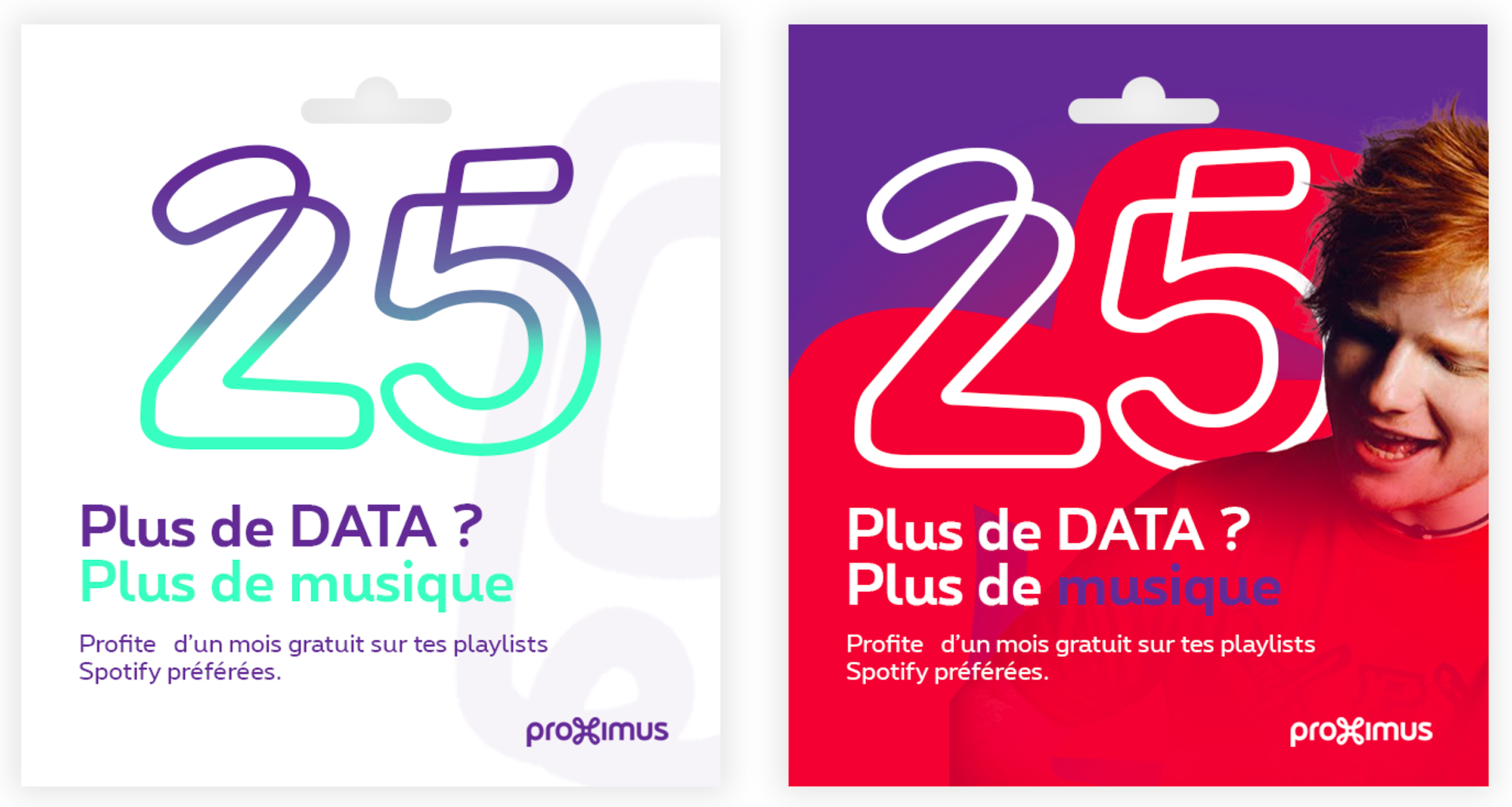
Integrating promotional and marketing variations into the systematic UI without breaking the core structure.
Extending the system to a revamped Proximus app targeting millennials
A living, breathing identity
A modern brand isn't static. We translated the new identity's energy into an organic motion system that felt native to the digital space, ensuring interactions were as recognizable as the logo itself.
Demonstration of the organic animation system for digital touchpoints
A system governed by the people using it
A design system in a corporate environment isn't just a UI kit; it's a governance challenge. My role extended beyond creating tokens and components. I established the contribution model, working directly with product teams, developers, and brand managers to negotiate the tension between creative ambition and enterprise constraints.
By treating the design system as an internal product, we turned a top-down mandate into a flexible, shared language that teams actually wanted to use.
The final result: a cohesive, enterprise-scale digital brand that feels unmistakably Proximus at every touchpoint.