Rethinking the train experience around discovery
A transport app designed for transactions, not journeys
The SNCB app serves thousands of users every month. But it treats every one of them the same way: as someone who already knows where they're going.
This exploration looks at how a transport app could go beyond booking and become a platform that inspires people to discover Belgium by train.
A hands-on look at the new discovery-first mosaic view
What if a transport app could do more with the question it already asks?
"What do you want to find?" The question is right. The answer could go further.
The app does what it's built for: fast, reliable trip booking. But "What do you want to find?" is a bigger question than a departure and arrival field can answer.
For someone without a plan, the current interface stays silent.
Breaking one question into four
"What do you want to find?" unpacks into four smaller questions: Where can I go? What can I see? When can I leave? How much is it?
If the home screen surfaces answers to these, it stops being a form and starts being an invitation.
Breadboarding the concept
Validating structure before opening Figma.
Breadboarding is a Shape Up technique that maps screens, actions, and connections as simple text and arrows, no UI, no visual decisions. It forces you to think about flow and logic first.
Here, four different entry points "where, what, when, how much" need to converge into a single booking flow without creating dead ends or redundant screens.
It's the cheapest way to stress-test an idea. If the structure breaks at this stage, no amount of visual polish will fix it.
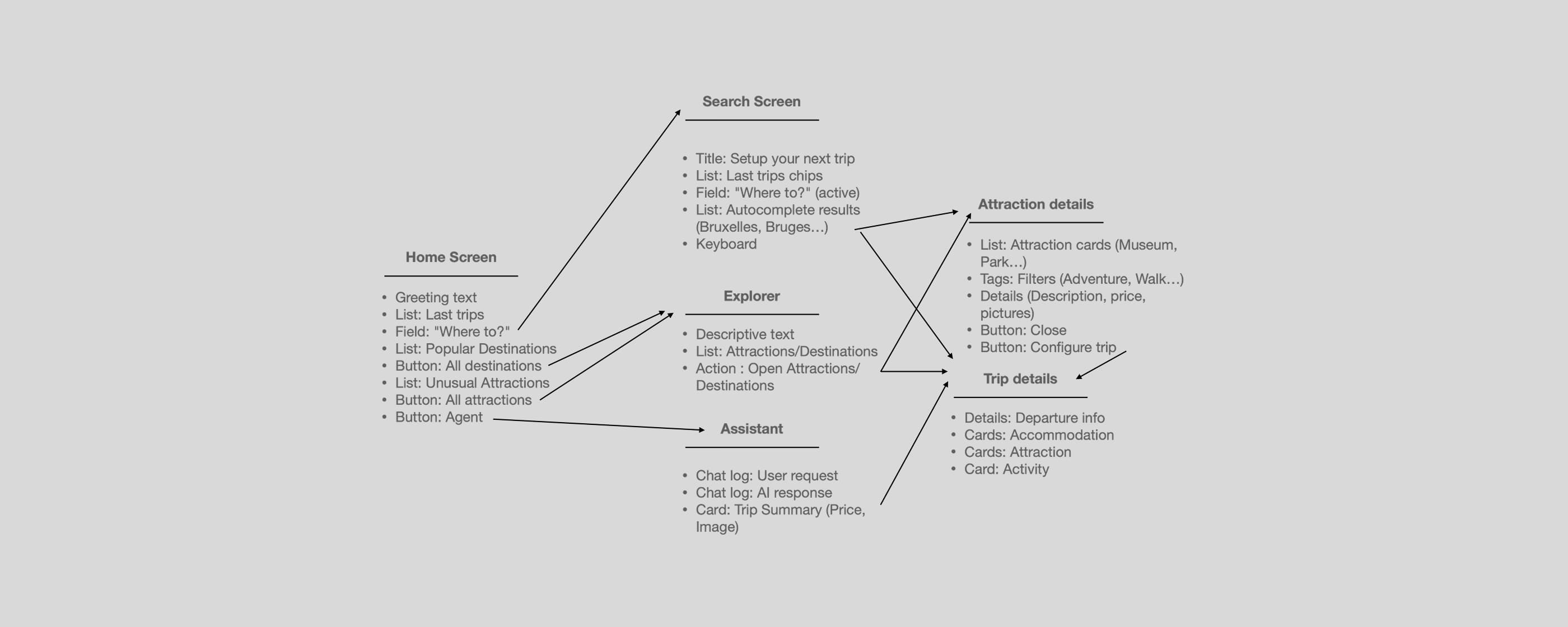
Breadboarding maps screens, actions, and connections at a structural level — validating flow logic before any visual design.
Weighing decisions
Every direction has a cost. Before committing to any solution, each option was evaluated against three criteria: user value, technical cost, and risk.
This matrix is about making trade-offs visible. A high-value feature with high risk isn't automatically rejected. A low-cost feature with low value isn't automatically shipped. The goal is clarity on what's being traded for what.
The three decisions that shaped this exploration
High user value, high technical cost. A recommendation engine is safer but can't handle open-ended requests. The assistant unlocks a fundamentally different interaction — worth the complexity.
High user value, highest risk. Pushing the booking form down could frustrate commuters. "Last trips" chips are the mitigation if they fail, the whole concept fails with them.
Moderate user value, moderate cost. The most balanced trade-off. A list would work. The mosaic bets that for this specific use case — inspiring unplanned travel — emotion outweighs efficiency.
The journey starts before departure
The home screen greets by name, surfaces last trips for quick access, and opens onto destinations reachable from the nearest station.
The booking form is still there, just no longer the only answer.
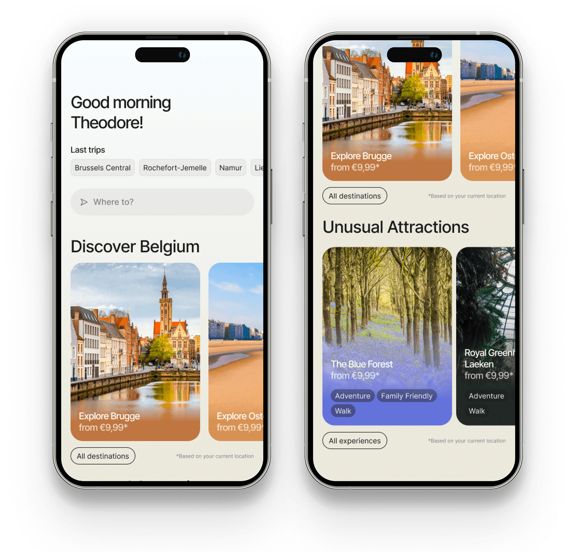
The redesigned home screen — greeting, last trips, and discovery-first layout
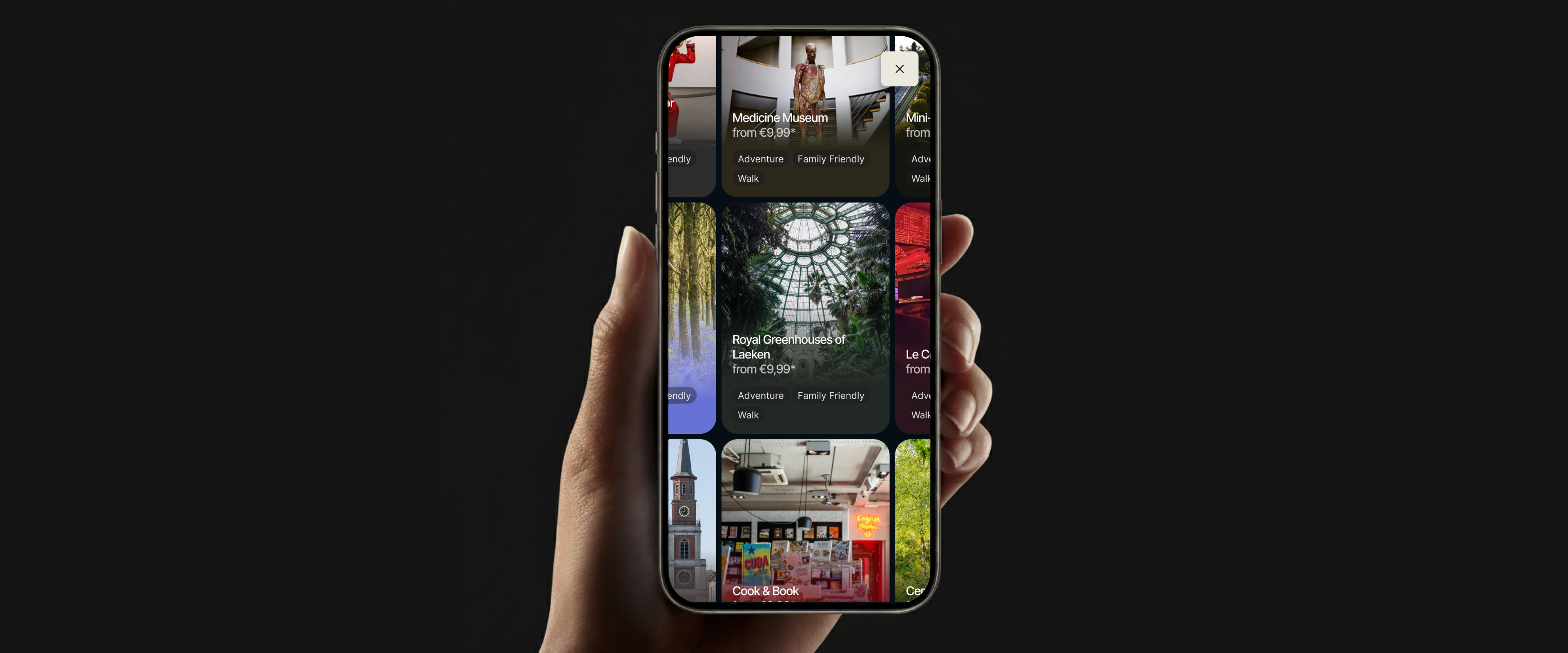
Exploring without doom scrolling
Instead of a traditional vertical list, tiles move organically in every direction based on the user's intent.
A mosaic built to let users stumble onto something they weren't looking for, which is exactly the point.
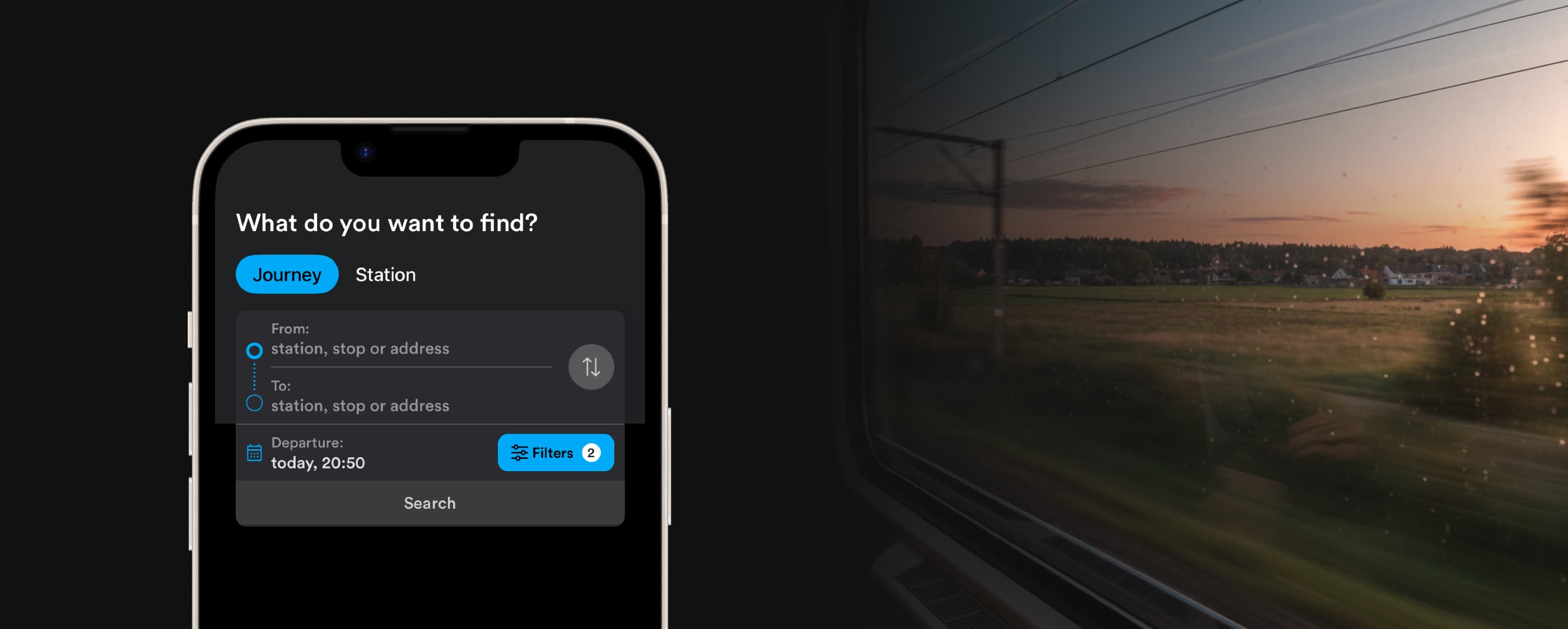
One question to start everything
A progressive form that unfolds as the user answers.
Last trips are surfaced as chips for instant recall, and autocomplete narrows options as the user types. The interface never shows more than what's needed at that moment. One field leads to the next, matching the natural logic of planning a trip: where, then how.
An assistant that plans the trip
"Show me places I've never visited." "Plan a day trip to Ostend for 120€."
Natural language is becoming the primary interface. The screen doesn't disappear, it becomes a companion to the conversation.
Users describe what they want, the assistant handles the complexity, and the UI surfaces the result. Two interaction models working together, not competing.
The best products start with a question worth exploring
This one started with "What do you want to find?" and ended with a vision for what a transport app could become when it designs for curiosity.
Independent work. Real methodology. No client brief. Just the belief that good design practice doesn't wait for permission.